
History and Context
According to market analyst Tom McClellan, the advance/decline line has been in use since 1926. A few decades later in the early 1960s, breadth measures such as the advance/decline line became more popular as Richard Russell, the writer of the Dow Theory Letters, used them to point out a negative divergence leading to the market top of 1961.
In general, stock market breadth refers to the health of an overall market. This can be measured in hundreds of ways not limited to the advance/decline line.
As our breadth proxy in this note, we will use the percentage of stocks in the S&P 500 (S&P) that are above their 200-day moving average. When a stock is above its 200-day average, it is in an uptrend.
A healthy market is when the stocks that comprise the S&P trend higher along with the price of the index.
An unhealthy market is the reverse, when the S&P trends higher while the stocks within do not. The technical term for this is a negative divergence, and as mainstream media says, “Breadth divergence is a troubling sign for the stock market.”
Three Bear Markets
Below are the three most recent bear markets. In each case, a negative breadth divergence preceded the stock market decline.
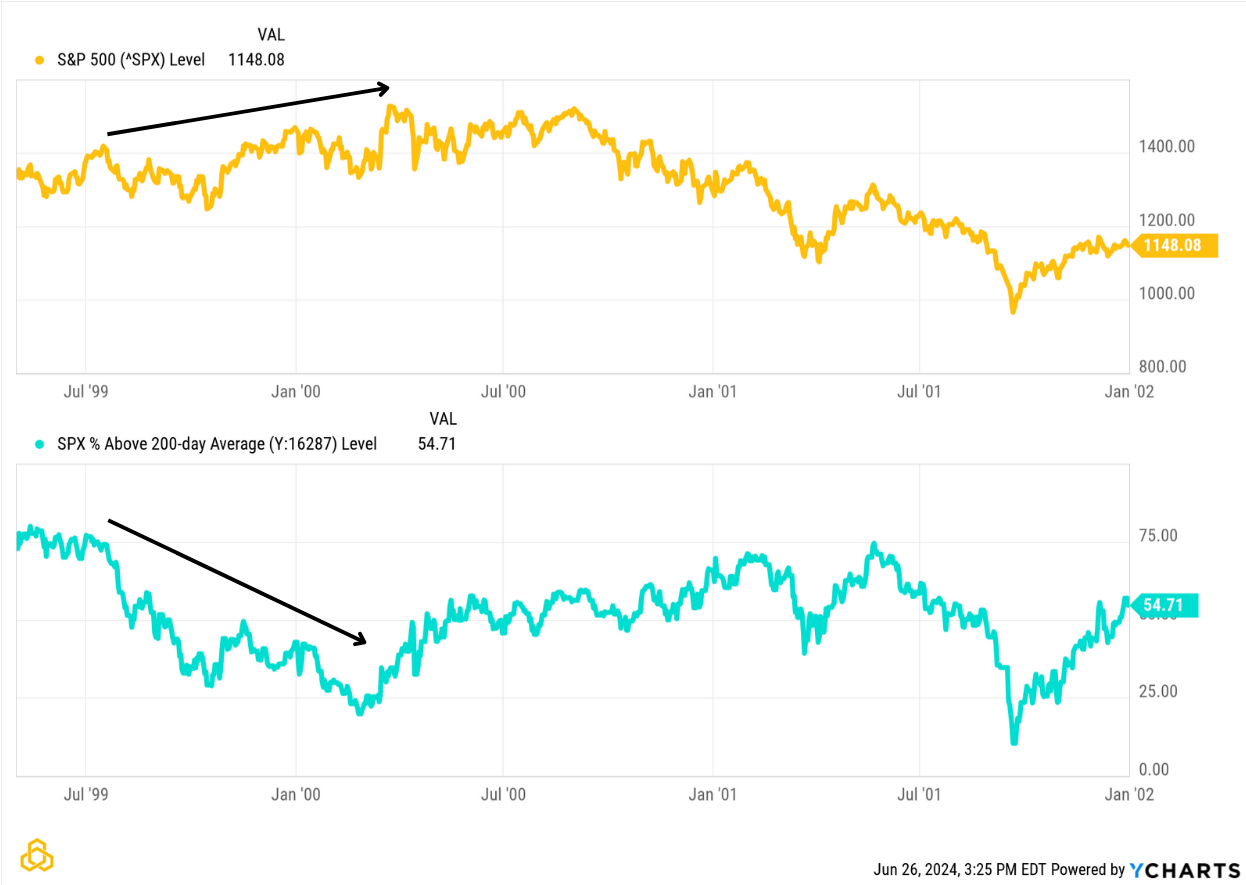
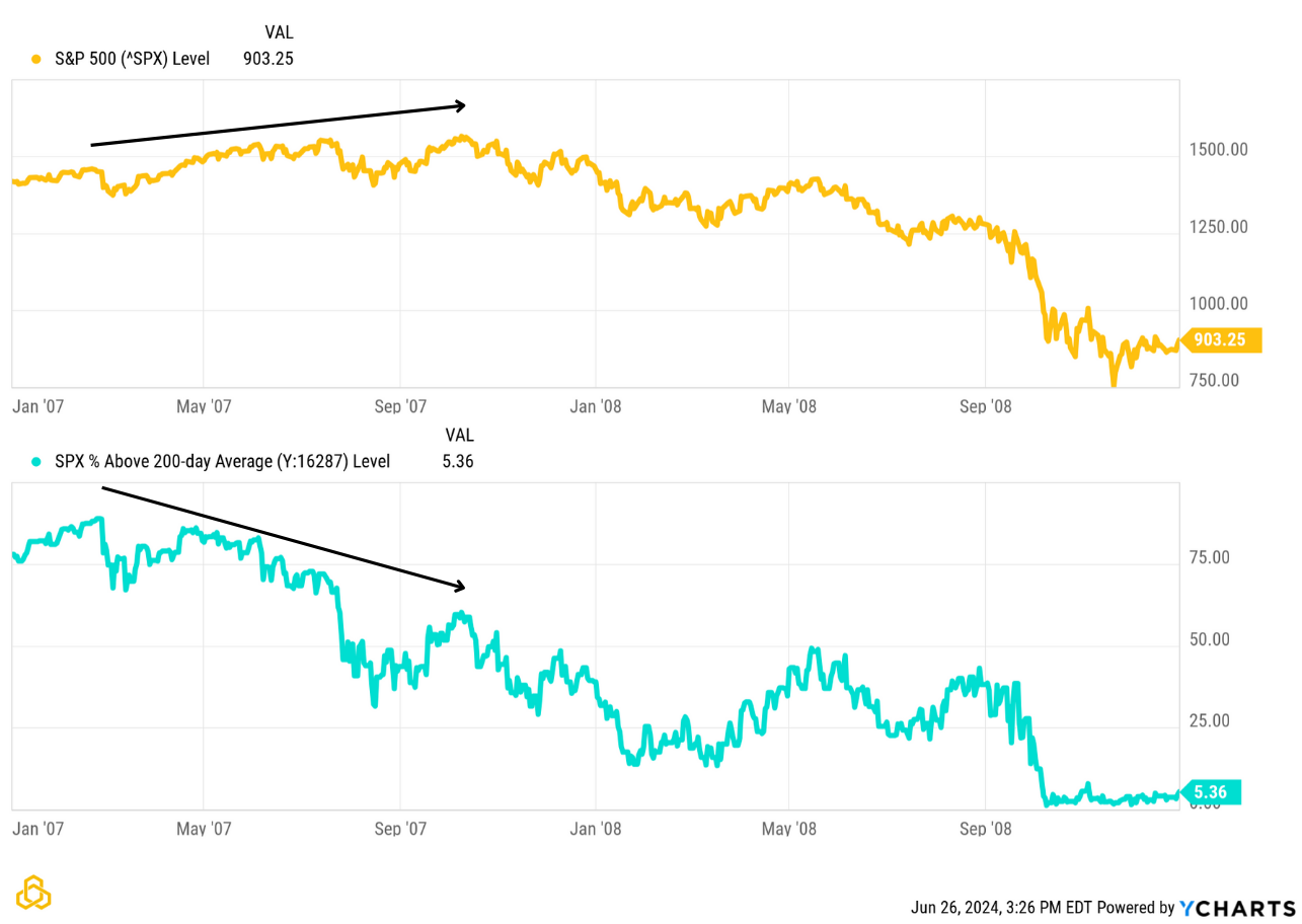
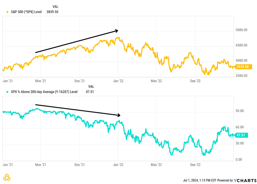
The S&P 500 price is yellow and the percentage of stocks in the S&P that are in an uptrend is blue, where uptrend is defined by the closing price above the 200-day simple moving average.
The 2000-2003 bear market began after most stocks lost their long-term uptrend. The price of the index rose, while the stocks within deteriorated.
The start of the 2007-2009 bear market saw a similar setup. The price of the index continued higher while the percentage of stocks above their respective moving averages trended lower.
Leading into 2022, a seven-month divergence eventually resulted in the most recent bear market.
The problem
As the late Daniel Kahneman explained in his groundbreaking work of prospect theory, “losses loom larger than gains”. Because of this, investors give more weight to bearish content. This leads to the media often prematurely painting a negative picture, using charts much like the ones above.
A negative divergence occurred before each of the last three major bear markets in stocks, furthering the media’s use of the phenomena.
However, this form of “ocular analysis” lacks a repeatable process, which is necessary for objectively quantifying and testing signals. To form a repeatable process from which signals can be derived, we must answer the difficult question:
How is a negative divergence defined?
Example System
The following rules attempt to quantify a divergence to form a trading system:
The S&P 500 price must rise by more than 10%.
At least 20% of stocks in the S&P lose their uptrend during the timeframe.
Both took place within the last year.
The chart below represents shorting the S&P 500 index for 252 trading days (one calendar year) when the rules above are true:
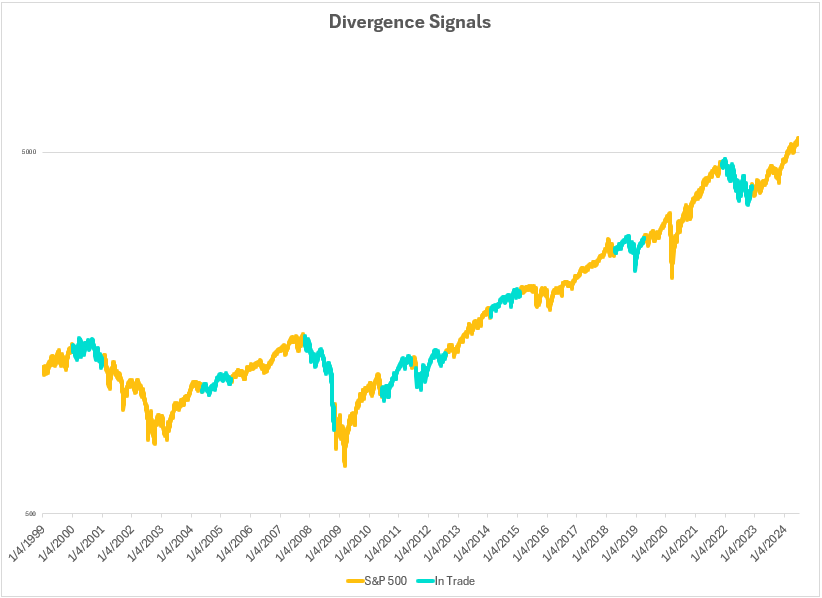
As the chart shows, using a divergence to time an entry is difficult. There are times where the system entered, and prices declined shortly after. At other times, the index price continued to rise despite stocks in the index losing their uptrend.
As famed economist John Maynard Keynes said, “Markets can remain irrational longer than you can remain solvent.” The quote is accurate here as well. A divergence can remain in place for many months while the stock market index rises.
Using breadth divergence to produce signals in isolation may not be the profitable and repeatable process that many suggest. This does not stop the media from using a negative divergence to trigger the human emotion that arises when a bear market might be near.
The Potomac Way
As we have seen above, divergences can stay in place for extended periods of time before they “produce” a meaningful decline in equity prices. Since they are such a poor timing tool, divergences alone do not cause us to act.
Breadth, however, is a key input to our composite models. Breadth measures the health of a trend. In a strong bull market, we expect to see more stocks going up than going down, more new highs than new lows, and more volume trading in the advancing stocks than in the declining stocks.
Since breadth is so key to our work, we view it through multiple lenses. One indicator analyses the trend in the weekly NYSE Advance/Decline Line by adding a moving average with upper and lower bands. A cross above the upper band is bullish, a cross below the lower band is bearish. However, a breakdown in the A/D Line alone is often not sufficient to generate a sell signal. Other bearish dynamics must also be in play.
Another indicator analyses the weekly advances, declines, new highs, and new lows as a stochastic. This indicator also looks at a stochastic of the weekly closing price of a large-cap equity index. What we are looking for, as a bullish signal, is the A/D Line to be as strong as or stronger than that index while new highs are strong and new lows are weak. The opposite can be considered bearish.
A third example incorporates volume. The volume of trading in the stocks that are going up relative to the stocks that are going down is considered a bullish sign of accumulation. Looking at the ratio of Advancing Volume to Total volume on the NYSE, we can establish thresholds. Multiple readings above a key threshold within a predefined period can indicate a cluster of accumulation that establishes greater odds for rising equity prices over the short/intermediate term. This can be a timely indicator after markets have sustained a meaningful decline; a sign that the selling pressure has abated.
As always in markets, nothing works 100% of the time. Additionally, signals can be enhanced when used in combination with other indicators.
Disclosure: Past performance does not guarantee future results. There is no guarantee that any investment strategy or account will be profitable or will avoid loss. Individual investors’ objectives, financial situations, their specific instructions, or restrictions on investments, or the time at which an account is opened, or additions are made may result in different trades and returns. Performance for the strategy presented may differ materially (more or less) from the performance of the comparable benchmark and other Potomac investment strategies. Market and economic conditions could change in the future producing materially different returns. You cannot invest directly in an index. This presentation is supplemental to the composite report. This information is prepared for general information only and should not be considered as individual investment advice nor as a solicitation to buy or offer to sell any securities. This material does not constitute any representation as to the suitability or appropriateness of any investment advisory program or security. Please visit our FULL DISCLOSURE page.
PFM-345-20240718